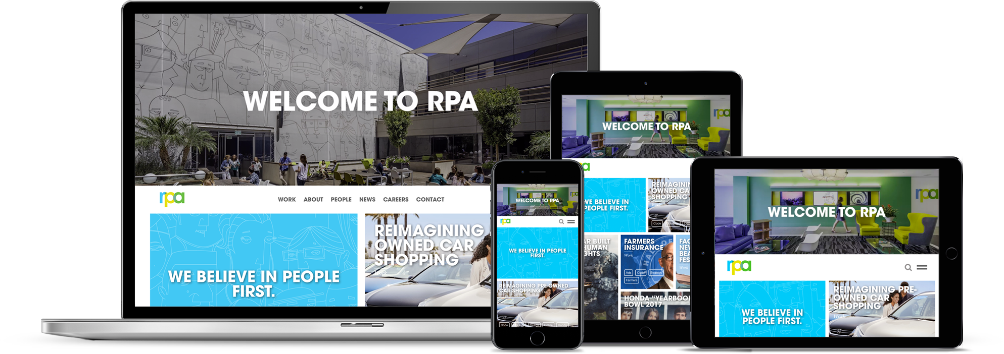
RPA WEBSITE REDESIGN
After changing the company's manifesto from "UNLEVELING THE PLAYING FIELD" to "PEOPLE FIRST," the site needed a refresh to align with the new identity. The team was also tasked with creating a CMS for the agency to quickly put up new work.
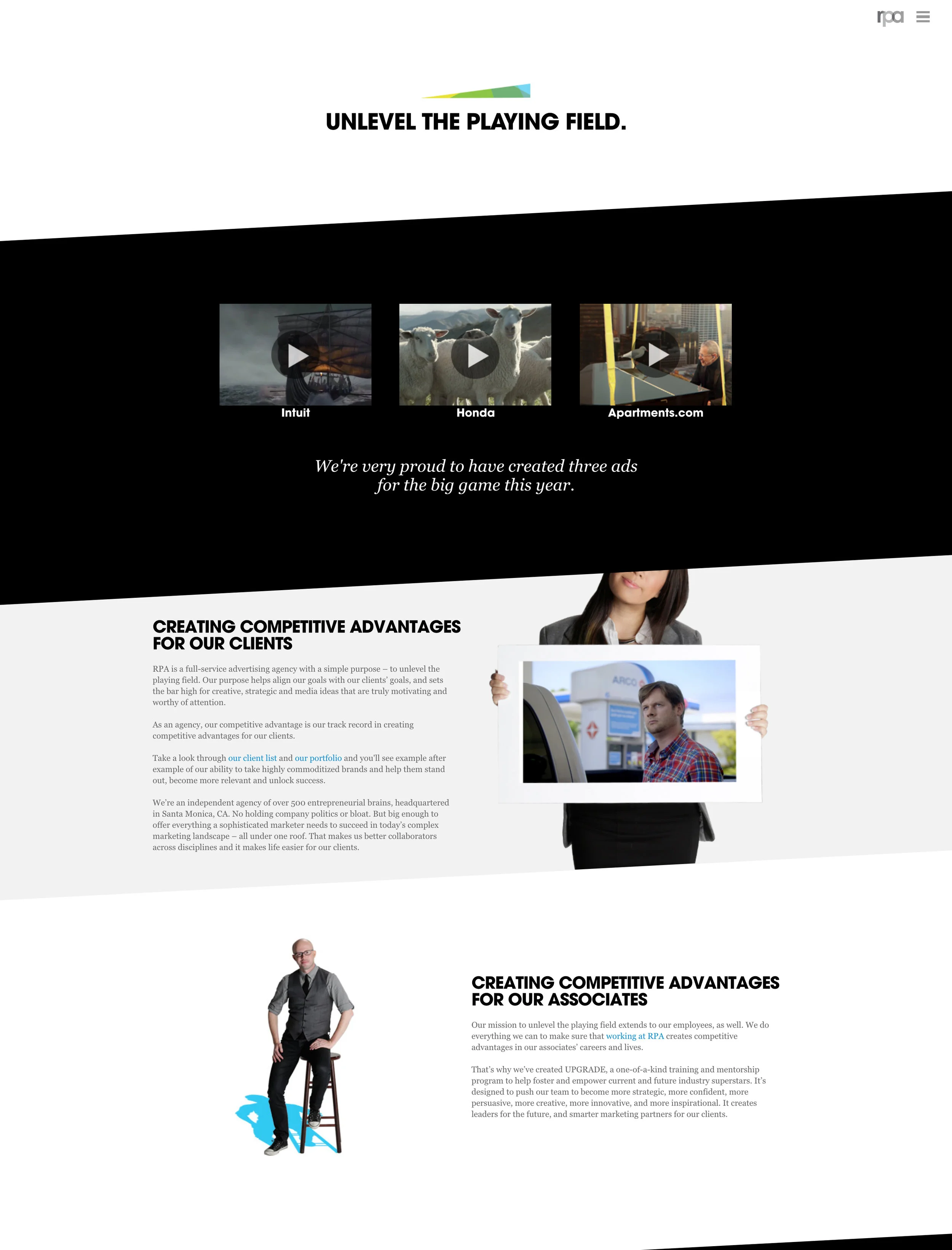
PREVIOUS SITE
WHAT WE REALIZED
In order for us to properly redesign the site, we had to fully dissect the existing site to see what was and wasn't working.
Some of our initial findings were:
We’ve been architecting and designing the site from the top-down.
We had some content organization challenges : What content “belongs” where? What to feature on its own? What to feature as part of something else?
How to differentiate content: Case studies vs Projects, Bios vs Stories, Thought Leadership vs Blogs.
WHERE WE'RE GOING
"PEOPLE FIRST" means "SEEING THROUGH THE PEOPLE LENS"
Validate the idea that we see things differently, not just by saying it but by creating an experience that demonstrates it.
Instead, let’s design the site from the bottom-up.
Instead of designing buckets to hold articles and tags, design around the articles and tags themselves.
Instead of designing an experience and filling it with content, let the nature of the content drive the experience.
WHAT WE PROPOSE
LET'S DESIGN THE ULTIMATE RABBIT HOLE. Intuitive and easy to follow. But endlessly rewarding, and seemingly bottomless in depth and richness of content. In a word: the first people-first agency website experience. You tell the site what you want to see. The site doesn’t tell you how to organize your experience. Instead of a top-heavy nav, we use a system of tags to organize the content. We build the site on the backbone of a robust tagging system. And instead of multiple section layouts (gallery, bios, about), a single site experience houses everything. You can explore and poke around, or choose the lens that’s most relevant to you. A site that empowers the user. Based on the power of articles and tags.
DESIGN
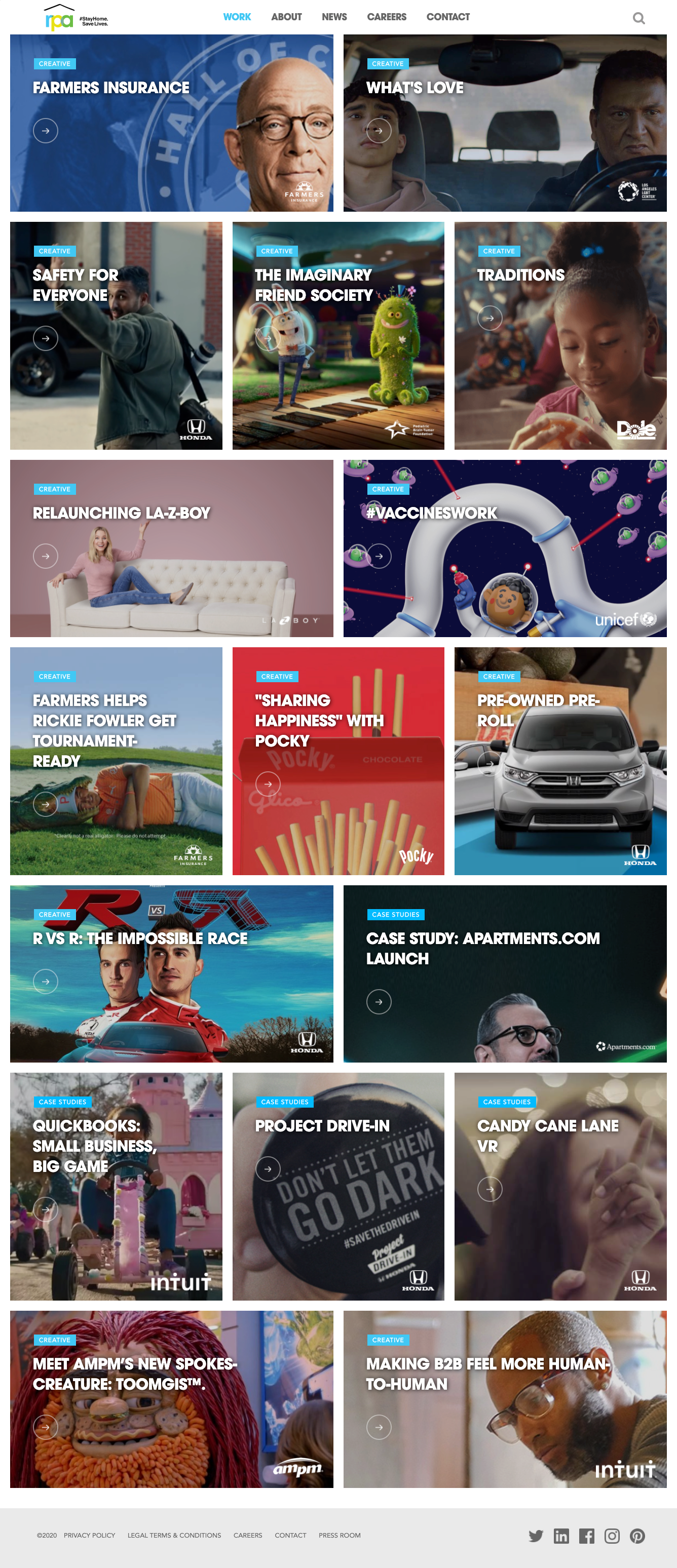
RPA.com's Work Section is contextually visual to give an exploratory feel.
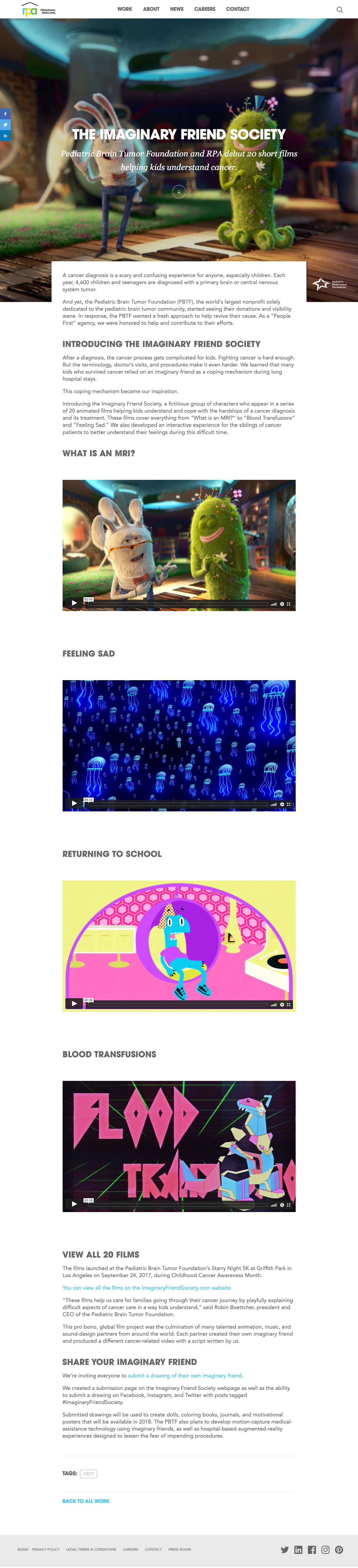
Everything is an article. Everything has context and a story. Sometimes deep, sometimes brief.
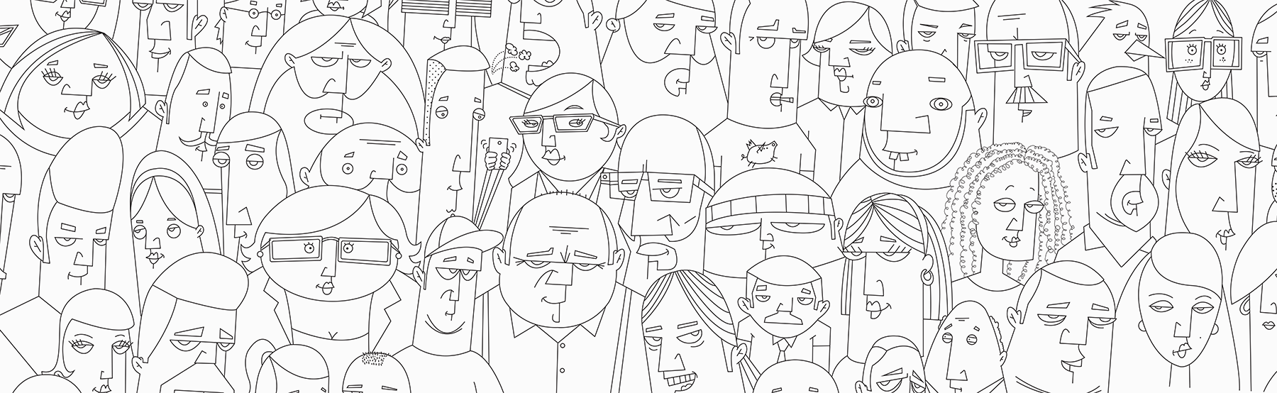
A MIX of Crow-toons and photos of the agency gave prospective employees a feel of the agency and its’ people.
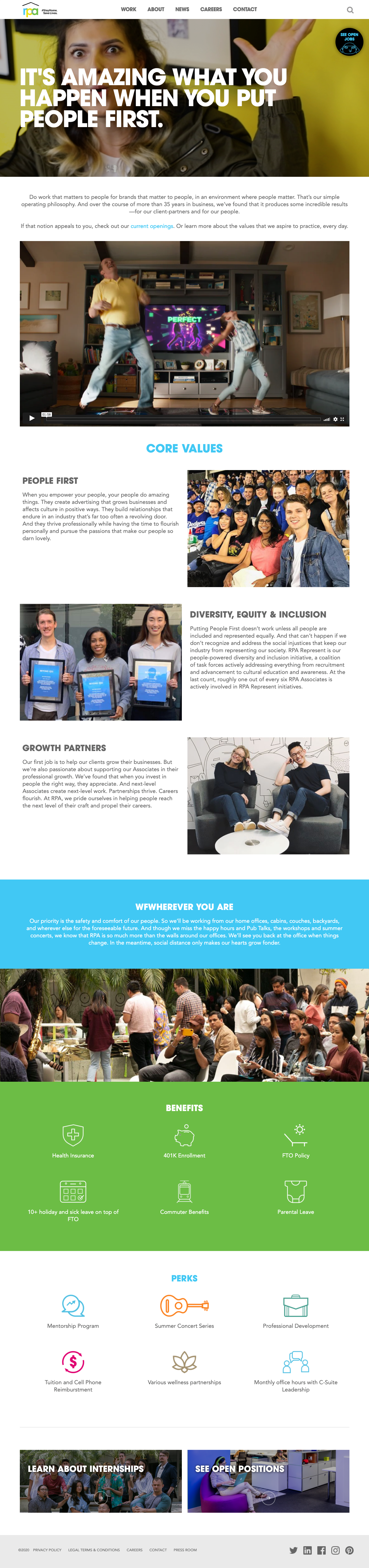
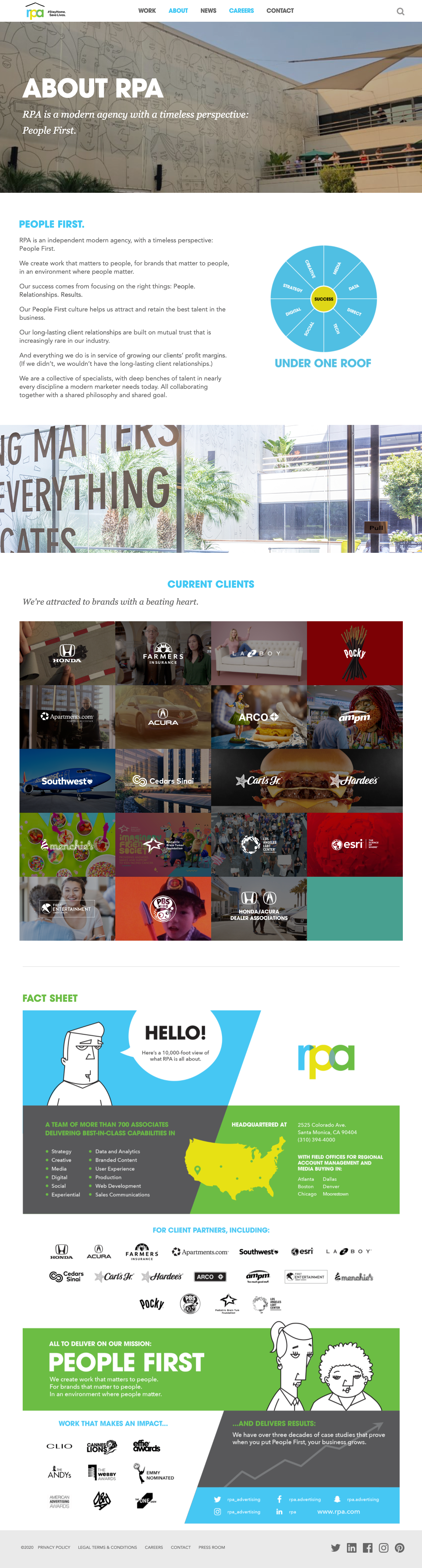
We gave our CAREERS page a major facelift by adding more content about the company’s philosophy, as well as highlighting some high-level BENEFITS/PERKS to entice PROSPECTIVE employees.
Explore RPA's redesigned website.
CD: Jason Hines
CD: Bang Pham
CD: Yama Rahyar
UX: Sabrina Lee
Copywriter: Eric Lee