REDESIGN PROCESS
During our scoping phase, we had some help from our STRATEGY team to give us unique insight on ampm's demographic:
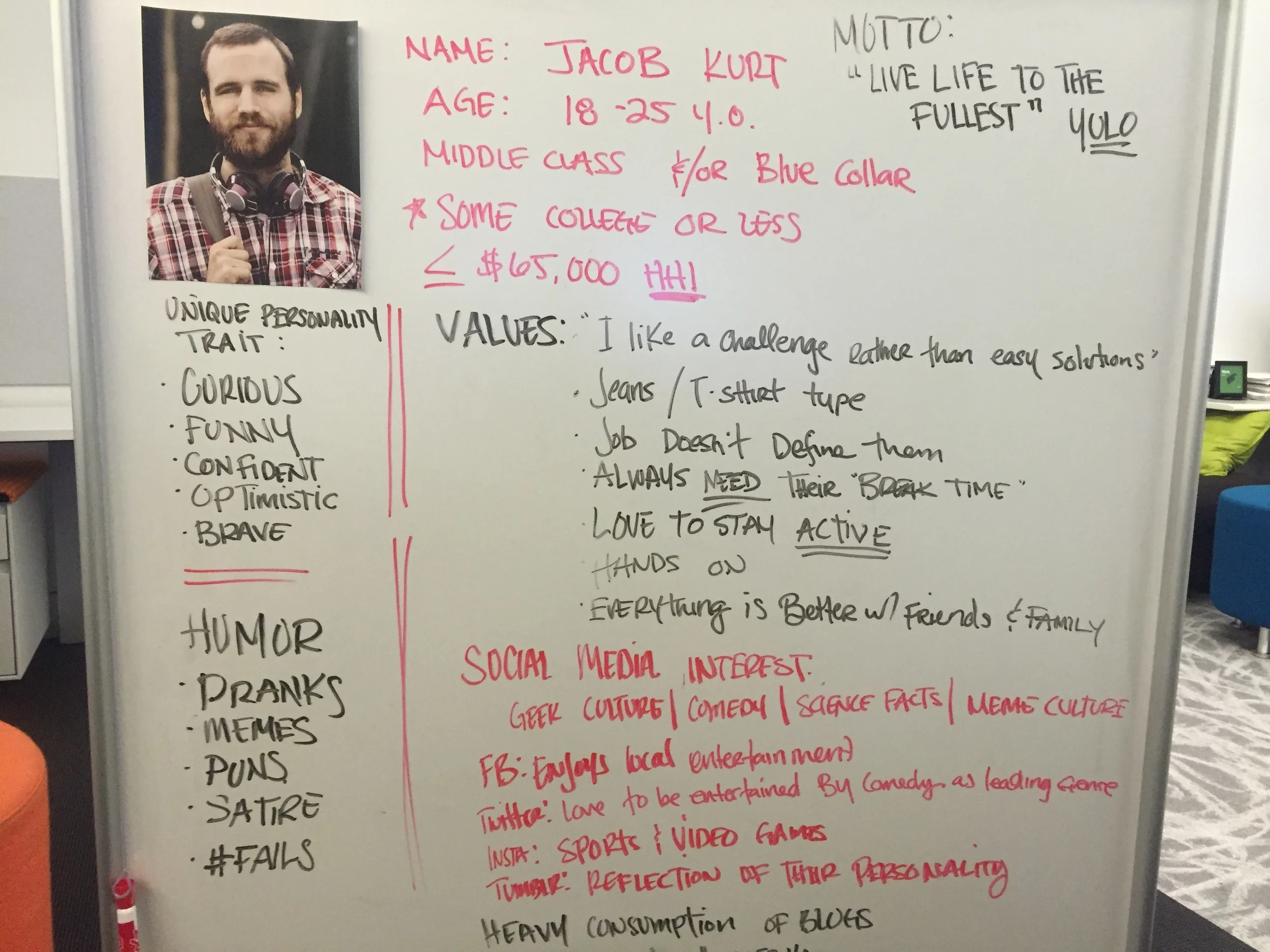
With the information we received, it gave us a better understanding of how we could better design the site to cater to the users habits and needs.
We also looked into digital trends and found some interesting user insights:
Instant Gratification
eBay Now - $5 deliveries in 1 hour
Uber
Amazon Fresh
FLOW VS FRICTION
Flow: A smooth, seamless experience
• Across devices (pick up where they left off, remember what they liked)
• Across services/platforms (easily enabling sharing, etc.)
• Taking advantage of “micro-moments”
Friction: Digital barriers, distractions and speed bumps that interrupt experiences and prevent consumers from accomplishing what they’ve set out to do.
Expectations set outside the category
Serendipity: Creating an experience that would surprise and delight users
Shift to visual: Shorter attention spans combined with the progression of technology has led to a more visual culture that is less reliant on text.
DESIGN PROCESS
We presented ampm with a variety of themes we could base the website on. Among the different ideas presented, two resonated with the client:
CRAVING & NEEDS –In this option we would pull dynamic content to populated based on crave states/needs. The site will feel alive as it changes throughout the day, producing the right content for the right moment.
The messaging will be witty and product-focused—it will make mouths water.
We believe this is a great way to romance customers while showing them everything ampm has to offer.DISCOVERY/EXPLORATORY –In this option we help users find the nearest ampm while tapping into their cravings. And by integrating product suggestions into the experience, we satisfy these cravings without additional clicks.
The messaging will be straight and speak to hungry people who are on the go.
This approach serves customers who know what they want, while still suggesting products through the site’s utility.
In the end, the team merged the two ideas to communicate, engage and better reflect the ampm brand in order to strengthen the proposition that the website is where you can get "Too Much Good Stuff."
As we were designing the site, we kept in mind that the site should give users the feeling of the “physical" experiencing of an ampm store, digitally. The site had to entice the user with its offering; giving them a (positive) sense of being overwhelmed by the choices they can make. After multiple iterations, we landed on a look & feel that best met our objectives.
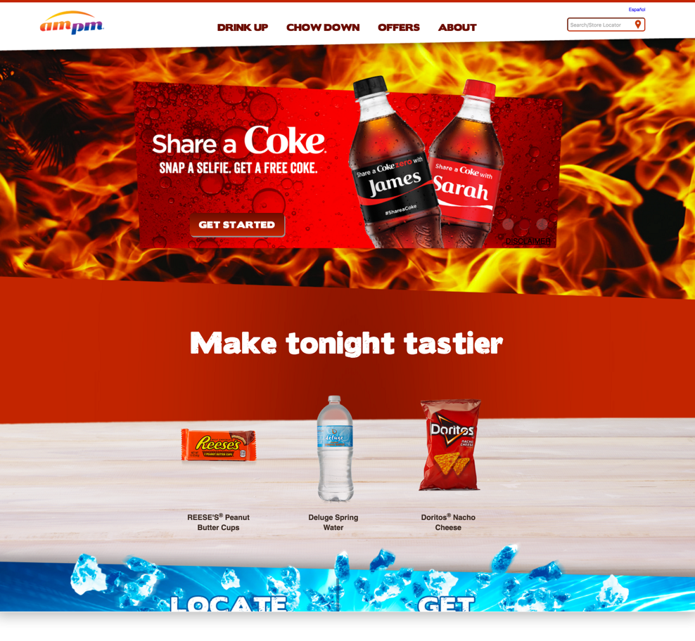
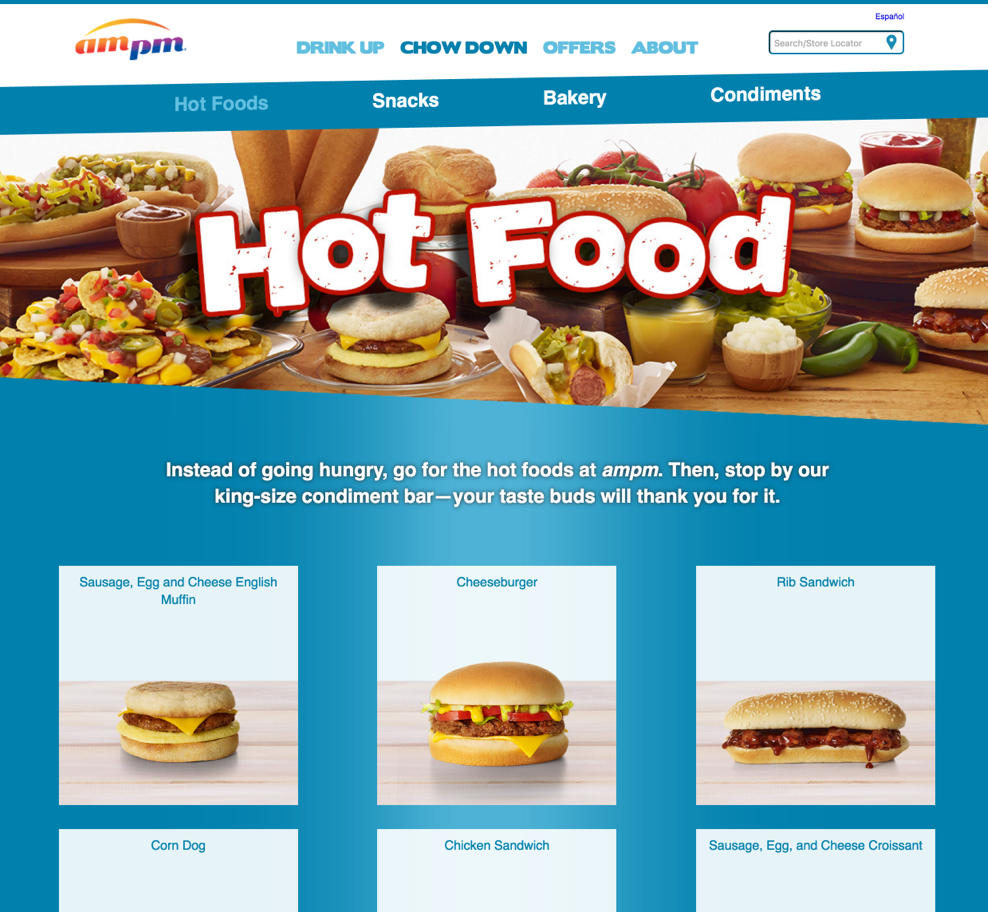
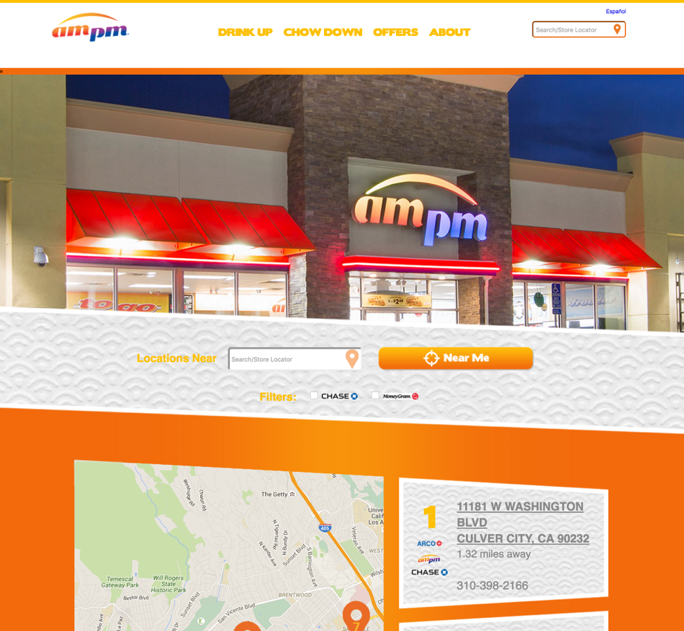
Upon arriving to the website you are greeted with a bright pop of color depending on what time you visit the site: Yellow (sunrise), Orange (breakfast), Blue (snack), Red (lunch), Maroon (mid-afternoon snack), and Purple (dinner/late snack).
In our research we found that many customers who visit ampm go in with the intent to buy an already predetermined item, but end up leaving with something additional because they happen to cross paths with it while walking down the aisles. We wanted to reflect this sense of “discovery,” by adding a Featured Product's module to push items we knew that sold well during a particular time of day.
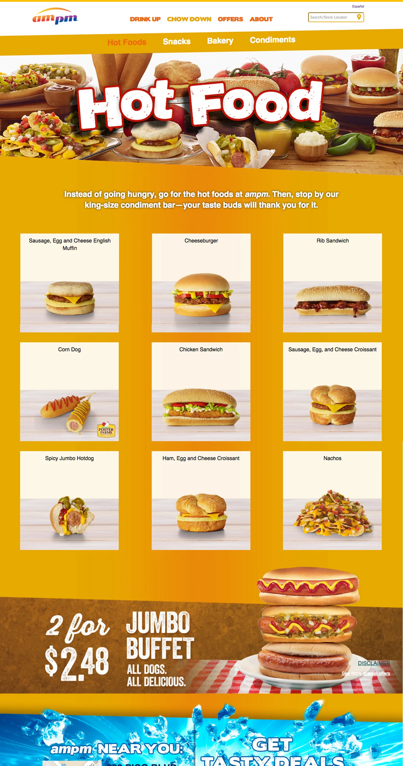
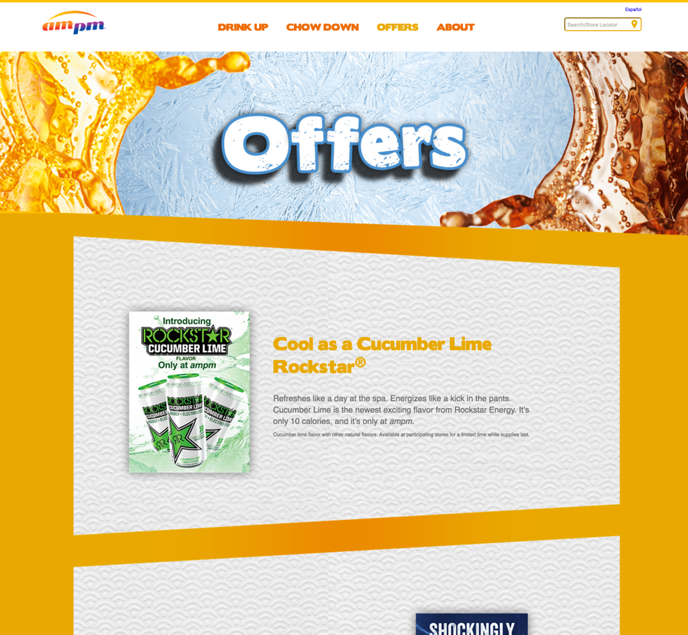
We wanted to create an exploratory experience by incorporating the slants from ampm's branding. By breaking the pattern of how users scan the page (LEFT – RIGHT ; TOP – BOTTOM), users now are free to scan diagonally giving a more playful interaction to the site. We also used the slants within our promo banners; rather than using the typical SQUARE/RECTANGLE shapes, the angles gave us the flexibility to be playful with how we visually serve promos.
SOLUTION
We created a website that was both visually engaging, as well as intuitive. The website changes 6 times throughout the day to cover different "crave states." The shift in the 6 different look and feels, surprise and delight incoming users to a change of scenery and food offerings. We also added utilized photography to entice users with products ampm provided.
Need a break? Visit ampm.com
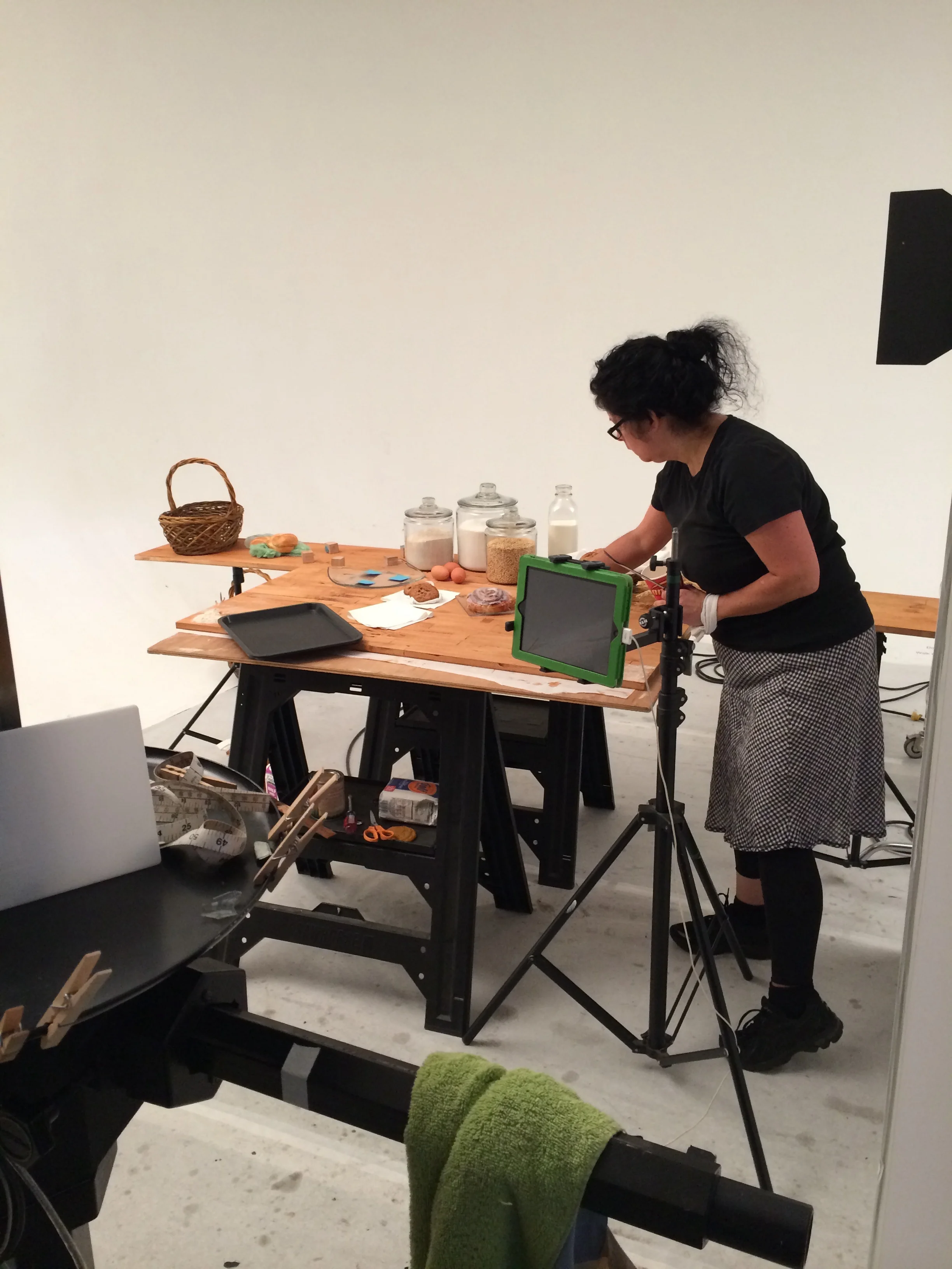
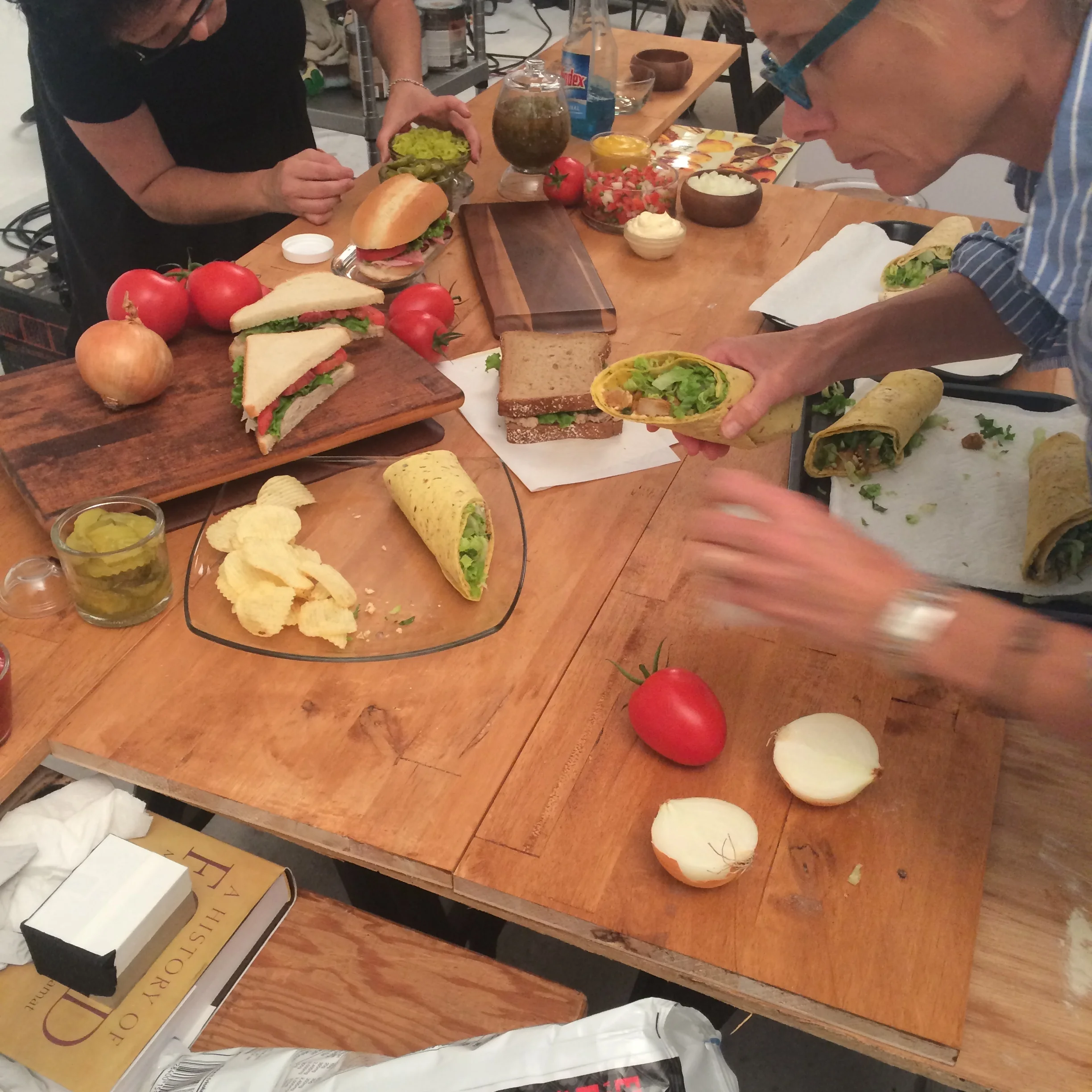
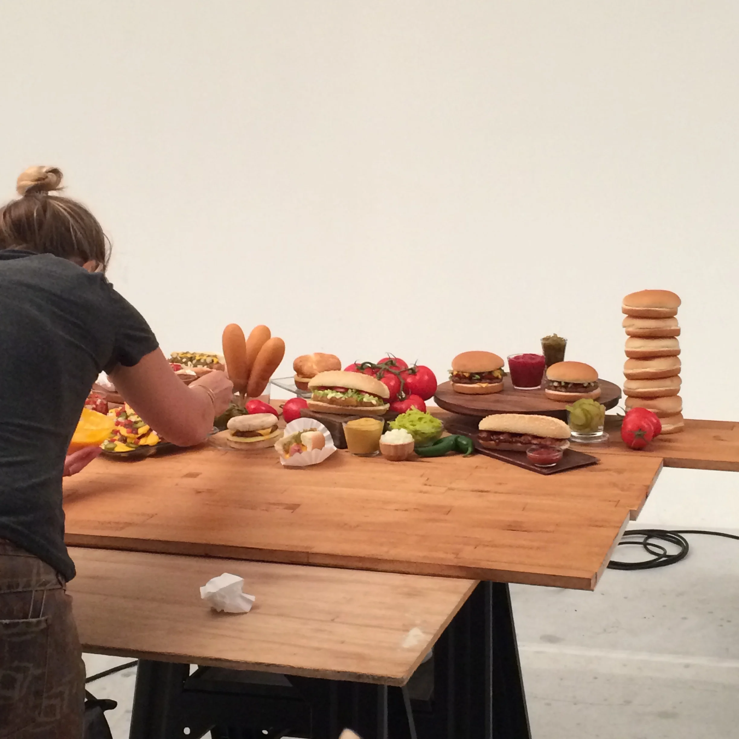
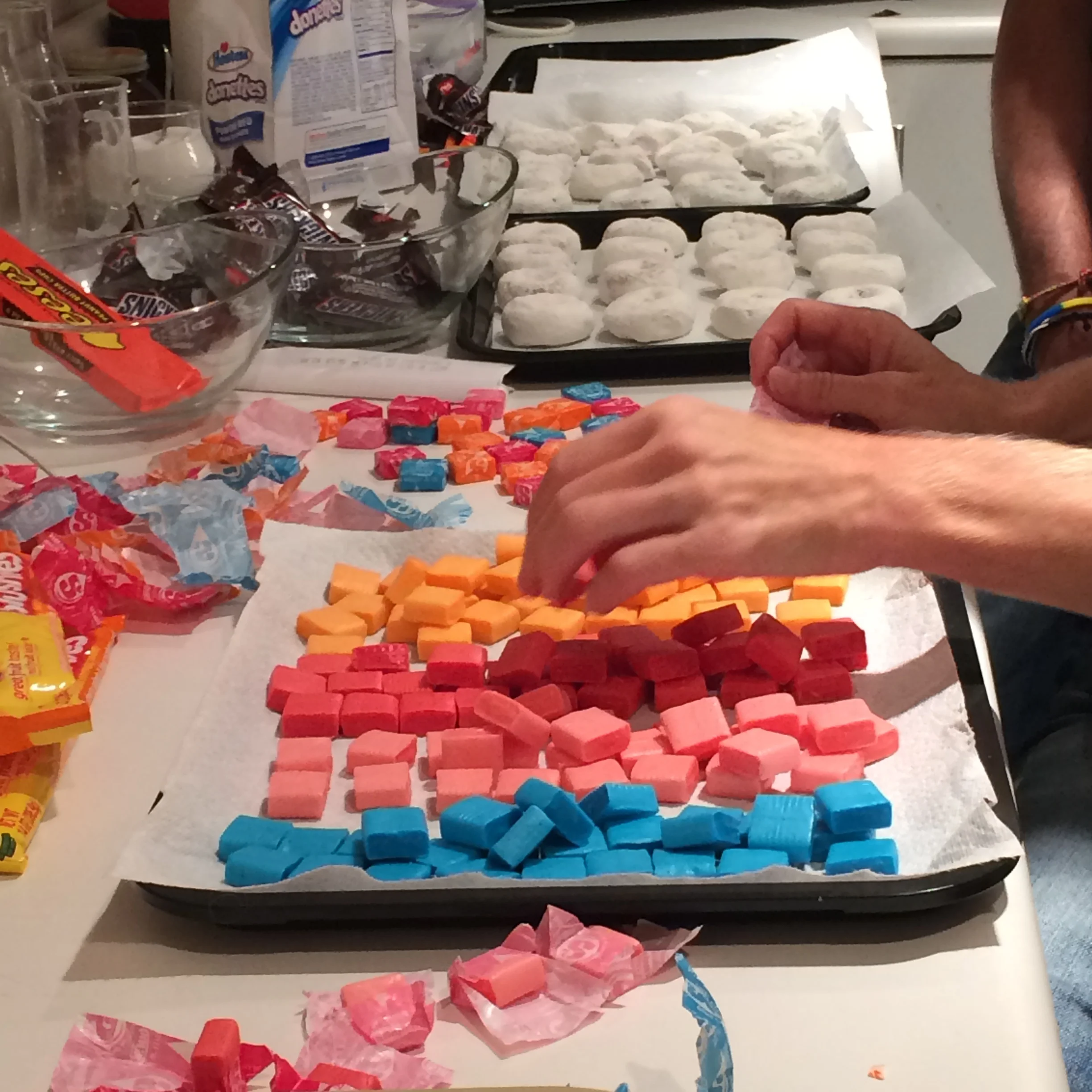
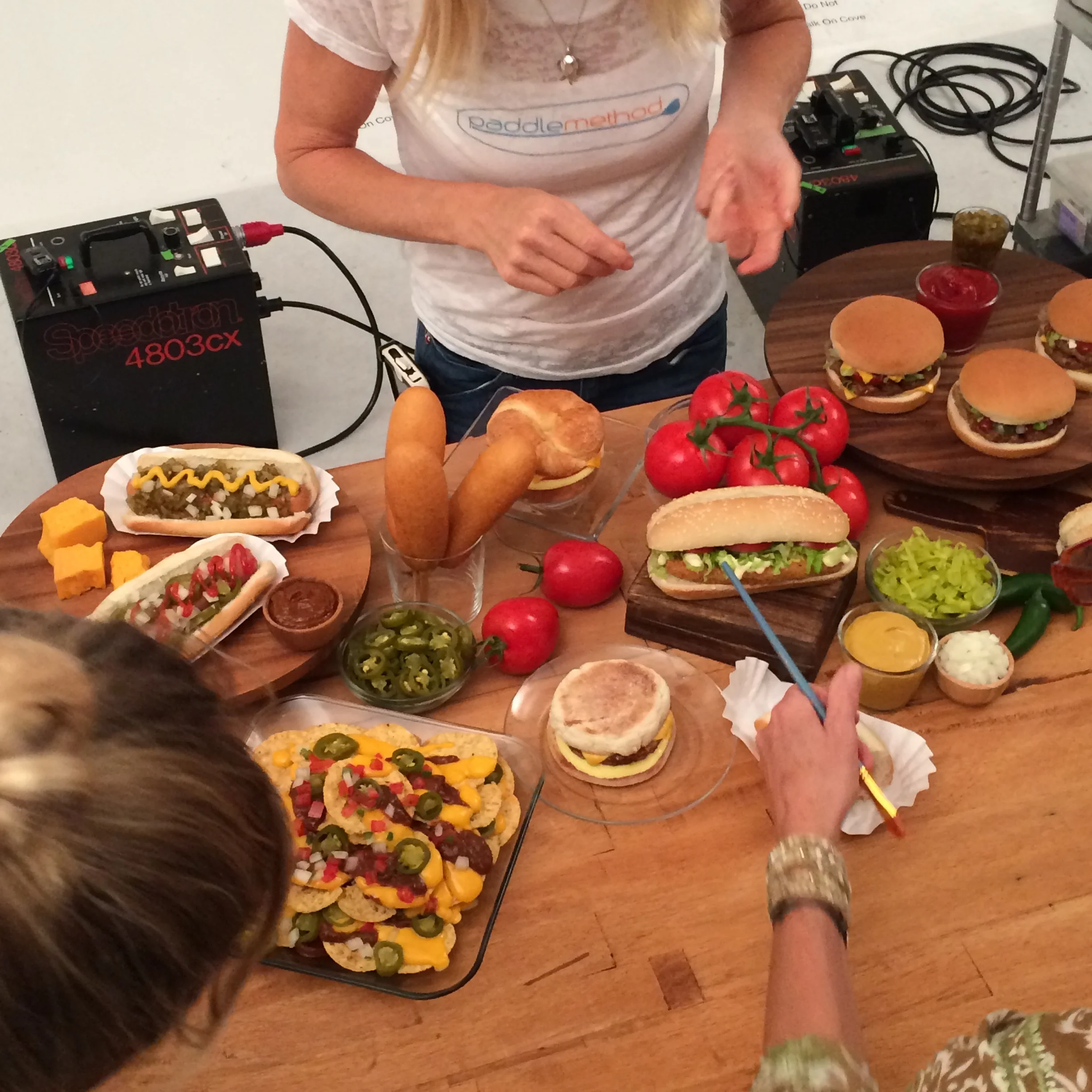
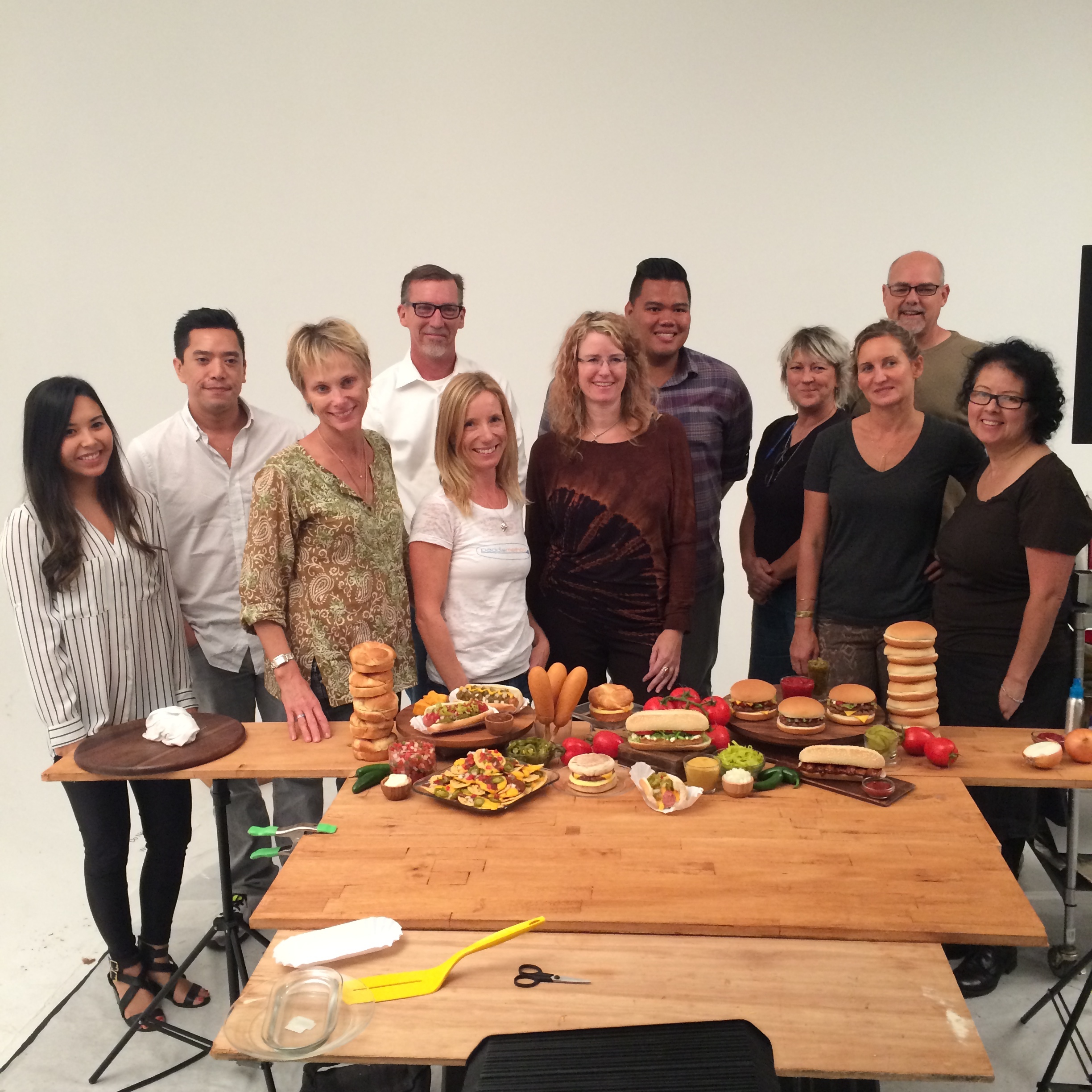
BTS PRODUCT PHOTOSHOOT